Time... What is time? Tick, tock, tick, tock, there goes the clock.
Eniwei. Time's an interesting little thingamajig. I mean, after all, you count work time... But not free time. So what's really the point of it? Stressing people out with deadlines and such?
Some people think of time as a line - things will never repeat themselves, and everything that is done, is done. Others think of it as a circle - a continuous pattern, always repeating itself exactly. But what do I think? Myself, I think of it as a middle thing - a spiral. Things do repeat, but not always in the manner that we expect, nor the amount of time we think it will. Nor are they regular, or even remembered, occasionally. (Though I can give no example of this.) I do not like the thought of a circle, for it implies fate, and that we have no choice of our own action. Nor do I like the line, because it means that nothing will ever happen again that way, and I am quite certain that events do, to a certain degree, repeat themselves - only not in ways that we tend to anticipate.
I suppose that the point of time - as in, a way to tell it - is for our own sanity. Humans as a species are very concerned with time, and it can be very difficult for us if we do not know what it is. An example of this can be taken from one of my own experiences - Camp Refugee. Under no circumstances will I ever return there, but I learned there. One of the rules that was learned was, for instance, that at Camp Refugee, it is always 7 o'clock. Always. At Camp Refugee, I and many others spent 24 hours as refugees, with no food, and only the water that we brought ourselves. We walked almost the entire night, and when morning came once more and we were gathered again, we readily believed that we had walked four and a half miles. Why? Because it felt that way. The combination of not knowing what time it was, and having to walk all day and all night made it feel that way.
How far had we actually walked? 7 kilometers. 7. A distance that I, at the time, would walk to get to and from school, in what would take an hour or so. Time, or rather the lack of knowing the time, had distorted our feeling of distance, so that it felt as though we had walked longer than we had.
Lastly, there is the curious thing about time, in that if you are having fun, it seems to pass faster, while if you are bored, it passes slower. Time is not set in stone. The older you are, the faster it passes. The more you dread something, the faster time passes to that point. The more fun you have, the faster it passes. And vice versa, in all cases.
torsdag 6. desember 2012
torsdag 29. november 2012
Almost done
Sooo..... I'll prolly need another lesson to finish. On the good side, I've got it C: Mr. Roman gave us an extension, so I have time to finish the dial and put in the mechanism. I ended up with writing in yellow ink in the carvings, and the dial itself is being painted black. In fact, it's starting to look like leather!
The two of them are going to end up with the colour scheme of the creatures of a fairly well-known artist (Even though it wasn't meant to be, but I gave up and just did it.), namely Allison Theus, a.k.a. Beastofoblivion or Crispyfishsticks. (Her Tumblr: http://crispyfishsticks.tumblr.com/ And her dA account: http://beastofoblivion.deviantart.com/ ) There's also no picture of progress! because they've not been put up.
Ferris signing off.
torsdag 22. november 2012
Soon done!
I'm almost done - It should be only one more lesson, then it's finished. I've smoothened it up a bit today, and I ended up carving the writing in more.

That's my clock to the left there. The pieces are from Anisha's clock (It smashed D:) Eniwei, It's meant to be an ouroboros, and the dial says "Time is a circle" in English, Norwegian, and runes, as well as "Time is eternal" and "Time is now" in runes. I think I know which colours I'll go for as well (For the serpent, that is. I've got no idea about the dial)
Ferris out.
torsdag 18. oktober 2012
Time's a-ticking; Tic, Toc, Tic, Toc!
So, first unit after the autumn break: Clocks.
I had a few ideas from before, and, in the end, I had too many. The entire lesson ended up being a single large brainstorming session. I think I've decided now, though. Theses are some of my ideas:
-Cronus
-Sisyphus pushing the boulder
-Atlas holding the clock up
-An Ouroboros
-The TARDIS
-Short pointer for minutes, long for hours, as opposed to the normal way around.
-The starting classes of Dark Souls
-The bossesof Dark Souls
-A steampunk clock
And so on and so forth...
Eniwei, I'll prolly go for a Dark souls bosses, together with the Long/short handles.
onsdag 3. oktober 2012
Writeup on symbolic self portrait
Rrroight..... Here goes nothing, I suppose......
Investigation
I researched quite a bit on symbols before I started this, in particular colours. You can easily see this in the entirety of my painting - I have used quite vibrant colours in the foreground, and somewhat darker colours in the background. All the colours that I have used are colours that I like myself.
Not really much else to say, checked on how to draw a raven as well.
Design
Hopefully a bit more to say here.
*Ahem* There were a couple of things that I knew I was going to bring in right from the start: Gaming and Mythology. The mythology was incorporated using the raven in the background (Hugin, for Thought), the skull with the moon in its jaws (Hati, who hunts the moon), and the runes on the t-shirt, which was changed to look similar to a viking-style tunic I have at home.
The runes I chose (Berkano, Wunjo, Kenaz and Sowilo) each has a different meaning. Berkano stands for mental, physical and personal growth, as well as renewal. Wunjo means joy, comfort and fellowship, amongst other things. Kenaz is for creativity, knowledge and inspiration. Lastly, Sowilo stands for success, honour and health.
Now... The colours *Cracks knuckles*
The yellow is for joy and happiness (Of which I have a lot), the green for nature, life and learning. Blue can be for a couple of reasons, depending on the shade; The light blue is for a calm and youth, as well as helping with concentration and learning, whilst the darker blue is for truth.
Also, fun fact: the raven and the skull are not pure black, but a very, very dark brown. This is both because black is very hard to moderate and show various body parts with (i.e. the wings of the raven), as well as the fact that despite the two of them being the "dark" sides of their duo (Sköll and Hati, Hugin and Munin (Although its prolly just me)), they're not evil - they just do their job. I also gave them the brown intentionally, instead of, say, blue, because while they are the darker part of their duos, they are also the "warmer" parts - as opposed to their "twins", who would be colder.
Lastly, I also managed to incorporate the Halo 3 emblem on the helmet, to symbolise my love of gaming.
Creation
I didn't really have so many major problems with this; while time was an issue here (So many symbols, so little time.), I suppose I managed okay. I had some trouble with both the skin colour and the mouth (What colour is skin? ALL OF THEM!), I guess it turned out nice enough. Also, for the main part of the process (That is, until I had painted the mouth), my face was a complete creep.
'n' wi' that, Ah punt ye a' farewell!
June
onsdag 26. september 2012
Oops, no. Frida Kahlo(WIP)
.jpg)
Why? Mainly because this painting has a lot more to work with. It's also more similar to the one I'm painting. Whereas the Monet painting basically had almost no symbols, this one is chock-full of them.
So without further ado, let's get going!
The first similarity to note between our paintings is the use of animals; I use a raven and the skull of a wolf, while she uses a panther, a monkey and a hummingbird. All of these are black, just as I intend to paint mine black, or near enough.
Black an easily be seen as an ominous colour, as well as the colour for death. However, I think that, in this painting, Kahlo instead gave it a different meaning. Black cats, for instance, are seen as symbols of good luck instead of bad by some, for instance. In Hindu religion, the name of the deity Krishna means "The black one", whilst in Masai tribes, the colour is associated with rain clouds - a symbol of life and prosperity. Also, in Japanese culture, black is associated with honour, while white takes over the role of the "death colour".
Let's start off with the monkey, now.
Like the other two, it is not completely black - its fingers, belly, and important facial bits. However, this is probably only to make it easier to see it properly. A monkey can be a symbol of mischief and/or aggression, depending on the type and size, and it is here very small. It is also a part of the Chinese Zodiac, though Kahlo was born a year before the Monkey.
The second animal one sees is the Panther, which can be viewed both as a creature of danger and death - and one of beauty and protection. In Native American culture, it was namely regarded as the protector of the universe. As with most big cats, it is also seen as a symbol of ferocity and valor, as well as being loners.
The last of the black animals is the hummingbird on the thorns. Now, the hummingbird, due to its speed, can be seen as a symbol of time - both having little time, or stopping time. It can also be a messenger: It is fast, and precise. Its ability to fly backwards can be a symbol of looking back, at our past - but without being consumed by it.
onsdag 29. august 2012
Self portrait study
Self-Portrait study
Claude Monet or Vincent van Gogh?

Now here's a little problem; We were supposed to choose one artist whose self-portrait we would research, but I can't decide whether to go for that of Monet or van Gogh....
Monet
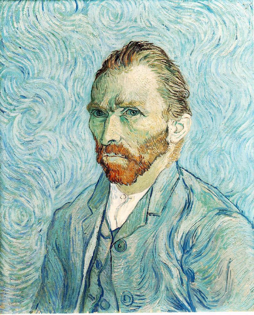
Monet's painting is very realistic, and his strokes seem very precise- he has a certain attention to detail, and his paintings seem far more peaceful than those of van Gogh. However, his painting also seems like it is "fraying" somewhat on the bottom, where he has not filled out the painting completely.van Gogh
As opposed to Monet, van Gogh's paintings are very energetic; his strokes seem to move as you look at them, and he uses a contrast in his portrait - the orange of his face and beard against the large amounts of turquoise and teal. Due to all the movement in his painting, he seems to have less detail, and he can more easily get away with minor errors.In the end, I think I'll go for Monet. Though van Gogh's painting looks good in its own way, I find that I prefer Monet's style.
søndag 29. april 2012
Writeup - masks
Investigation
We were shown some examples of masks in the first lesson, and I decided to go for an Aztec mask, mainly because I absolutely love Aztec culture. It also gives me a certain challenge, as Aztec masks were often carven from wood, before having mosaic stuck on top of the wood.
Creation:
I started out with some chickenwire, pressing it onto my face to create a basic shape for it. With the shape done, it was covered in paper mache, creating a surface to work on (Even if it was a bit mangled.)

I also created a nose by covering bigger chunks of paper with paper mache and fastening them onto the face, similar to what I'd done with the Bulbasaur model. I also cut off pieces of the nose to give it some more definition.
After having done that, I prepared a plate of clay to fasten on the mask, and left it to dry for a week.
The pieces were glued on with a glue gun to create a surface similar to mosaic.

However, there were too few pieces, so another plate of clay was prepared.
Having done that, I stayed behind the Wednesday before it was due, as I would be absent THursday and Friday due to hospitering.
I painted the mask with a somewhat bluish-green paint mix, and filled in what slits I had time to fill in with black paint.

The finished product. Fairly nice, if somewhat mangled in the mouth-area.
Evaluation
Overall, it ended up okay. I could have worked a bit more on the side of the face, to straighten it up a bit. It probably should have been thicker as well. The eyes fall out easily, and should have been made earlier, and the cracks need to be filled in. Except for all that it was good.
onsdag 15. februar 2012
Writeup on Pop art
Investigation
In the first lesson we were shown examples of pop art, and Mr. Roman explained what it was. I had quite a few ideas for what I should make, such as a warning about drinking and driving, or a pikachu, the very figure for pokémon, as it is, in a way, being consumed by the mass media and it's fans, until it is nothing but a pretty face for Nintendo to advertise with.
Mind you, I chose Bulbasaur instead.
Creation:
I wanted it to give a certain sense of abandonment, as if it had been thrown away by it's owner, perhaps in favor of a newer pokémon. I chose Bulbasaur partly because it is #1 in the national pokédex, and partly because it is easy to use to make a feeling of having been thrown away. Originally, there wasn't really much more than that: a bulbasaur, weeping over the fact that it had been abandoned, forgotten because of the newer pokémon. However, after some tips from Mr. Roman, I decided it could have a background, such as an empty street, to increase and/or clarify the abandonment.
I started out making it from clay, but it proved difficult to make, as the clay would dry upso that it was nigh-on impossible to add new bits to it. A new tip from Mr. Roman, and I decided to finish it off using paper mache. Two things remained clay, though, namely the face and the bulb. I had to spend some extra time after school the Wednesday before it was due, but it was worth it.
I fastened the face onto the body by first creating a small triangle of sorts on the back of its head using the paper mache, before fastening it to the body using several layers of paper mache whilst supporting it on a box of paperclips to make sure it wouldn't fall off.
I ran out of time for the background, though, so Instead I just had it be a simple box advertising that the bulbasaur was up for adoption, with the box saying "Did you forget about us?" in red paint at the bottom.
Evaluation:
I think it could have been better, as the bulb was much too small, and the face flatter than it ought to be. The colour of the body was also too green. However, I am fairly happy with it despite those problems.
onsdag 1. februar 2012
Update
Gee, long time no see, eh?
You know how I am (Hopefully); memory like a goldfish and concentration span shorter than the term itself.
Eniwei. I'm currently working on some pop art. A bulbasaur made out of clay, to be precise.

Last lesson I fastened the front legs to the body by using wet clay, as well as getting the stomach near completion. As you can see in the picture, it's supported bu a little modelling tool, so it'll be easier to make it look like it's sitting, which in turn is to make the weight a little easier on the legs. It's also almost hollow (It's filled with paper), again to make it easier on the legs. By the end, it'll (hopefully) have relatively bright colours (Green and blue, and a tiny bit of red), with the words "Did you forget all about us?" on the cardboard behind it.
Hopefully I'll remember to do this again later today.....
You know how I am (Hopefully); memory like a goldfish and concentration span shorter than the term itself.
Eniwei. I'm currently working on some pop art. A bulbasaur made out of clay, to be precise.
Last lesson I fastened the front legs to the body by using wet clay, as well as getting the stomach near completion. As you can see in the picture, it's supported bu a little modelling tool, so it'll be easier to make it look like it's sitting, which in turn is to make the weight a little easier on the legs. It's also almost hollow (It's filled with paper), again to make it easier on the legs. By the end, it'll (hopefully) have relatively bright colours (Green and blue, and a tiny bit of red), with the words "Did you forget all about us?" on the cardboard behind it.
Hopefully I'll remember to do this again later today.....
Abonner på:
Innlegg (Atom)